The Linear Model 1: Equation of a Line
Lecture 07
Dr Jennifer Mankin
12 March 2021

Looking Ahead (and Behind)
Week 4: Correlation
Week 5: Chi-Square ( )
Last week: t-test
Looking Ahead (and Behind)
Week 4: Correlation
Week 5: Chi-Square ( )
Last week: t-test
This week: The Linear Model - Equation of a Line
Next week: The Linear Model - Significance Testing
Announcements
Lab Report Drop-ins starting next week
Next week's practicals: Writing up lab report results
Week 9 practicals will start on the Linear Model
You still have a tutorial and quiz this week!
Next week: Academic Advising session on Discussion writing
- Designed for this assessment - please attend
Awards: SavioR nominations and Education Awards
Feedback via the Suggestions Box
Objectives
After this lecture you will understand:
What a statistical model is and why they are useful
The equation for a linear model with one predictor
b0 (the intercept)
b1 (the slope)
Both categorical and continuous predictors
Using the equation to predict an outcome
How to read scatterplots and lines of best fit
The Linear Model
Extremely common and fundamental testing paradigm
Predict the outcome y from one or more predictors (xs)
Our first (explicit) contact with statistical modeling
The Linear Model
Extremely common and fundamental testing paradigm
Predict the outcome y from one or more predictors (xs)
Our first (explicit) contact with statistical modeling
A statistical model is a mathematical expression that captures the relationship between variables
- All of our test statistics (r, t, etc.) are actually models!
Maps as Models
A map is a simplified depiction of the world
Captures the important elements (roads, cities, oceans, mountains)
Doesn't capture individual detail (where your gran lives)
Maps as Models
A map is a simplified depiction of the world
Captures the important elements (roads, cities, oceans, mountains)
Doesn't capture individual detail (where your gran lives)
Depicts relationships between locations and geographical features
Helps you predict what you will encounter in the world
E.g. if you keep walking south eventually you'll fall in the sea!
Statistical Models
A model is a simplified depiction of some relationship
We want to predict what will happen in the world
But the world is complex and full of noise (randomness)
We can build a model to try to capture the important elements
- Change/adjust the model to see what might happen with different parameters
Statistical Models
Why might it be useful to create a model like this?
Can you think of any recent examples of such models?
Statistical Models: COVID-19
Predictors and Outcomes
Now we start assigning our variables roles to play
The outcome is the variable we want to explain
- Also called the dependent variable, or DV
Predictors and Outcomes
Now we start assigning our variables roles to play
The outcome is the variable we want to explain
- Also called the dependent variable, or DV
The predictors are variables that may have a relationship with the outcome
- Also called the independent variable(s), or IV(s)
Predictors and Outcomes
Now we start assigning our variables roles to play
The outcome is the variable we want to explain
- Also called the dependent variable, or DV
The predictors are variables that may have a relationship with the outcome
- Also called the independent variable(s), or IV(s)
We measure or manipulate the predictors, then quantify the systematic change in the outcome
- NB: YOU (the researcher) assign these roles!
General Model Equation
We can use models to predict the outcome for a particular case
This is always subject to some degree of error
Making Predictions
Last week, we looked at the Language and Word Forms subscale of the SCSQ
If I wanted to predict someone's Language score...
- What would be the most sensible estimate?
Making Predictions
Last week, we looked at the Language and Word Forms subscale of the SCSQ
If I wanted to predict someone's Language score...
- What would be the most sensible estimate?
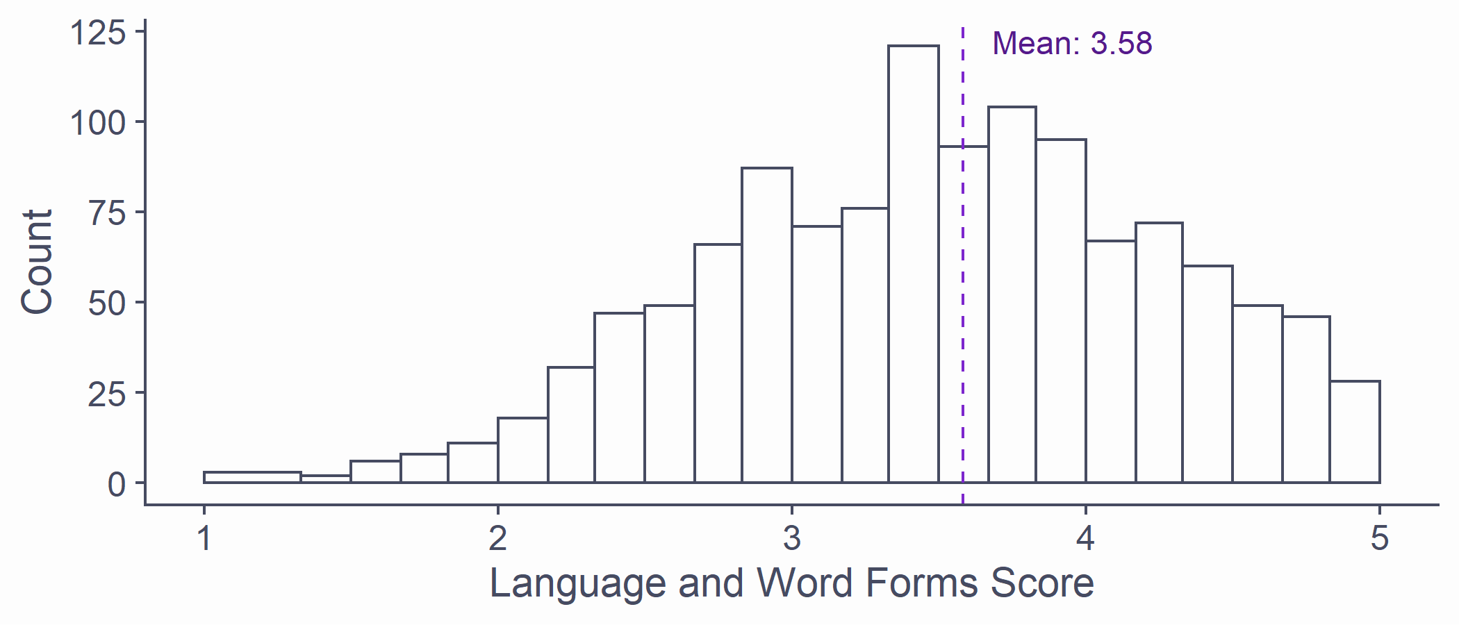
syn_data %>% ggplot(aes(x = Language)) + geom_histogram(breaks = syn_data %>% pull(Language) %>% unique()) + scale_x_continuous(name = "Language and Word Forms Score", limits = c(1, 5)) + scale_y_continuous(name = "Count") + scale_fill_discrete(name = "Synaesthesia") + geom_vline(aes(xintercept = mean(Language)), colour = "purple3", linetype = "dashed") + annotate("text", x = mean(syn_data$Language) + .1, y = 122, label = paste0("Mean: ", mean(syn_data$Language) %>% round(2)), hjust=0, colour = "purple4")Making Predictions
Without any other information, the best estimate is the mean of the outcome
- But we do have more information!
Making Predictions
Without any other information, the best estimate is the mean of the outcome
- But we do have more information!
Last week: Grapheme-colour synaesthetes score higher than non-synaesthetes on the Language subscale on average
We could make a better prediction if we knew whether that person was a synaesthete
Use the mean score in the synaesthete vs non-synaesthete groups
Let's write an equation that we can use to predict someone's score based on whether they are a synaesthete or not!
Making Predictions
First: the non-synaesthete (baseline) group
If someone is a non-synaesthete, predicted Language score = 3.55
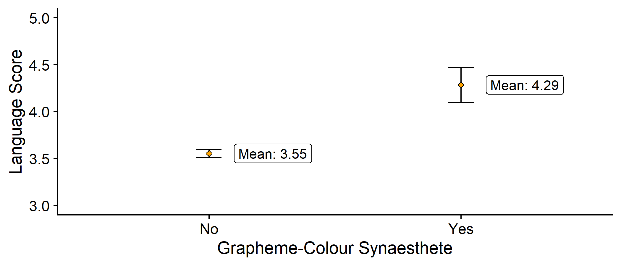
syn_data %>% dplyr::group_by(GraphCol) %>% dplyr::summarise( n = dplyr::n(), mean_lang = mean(Language), se_lang = sd(Language)/sqrt(n) ) %>% ggplot2::ggplot(aes(x = GraphCol, y = mean_lang)) + geom_errorbar(aes(ymin = mean_lang - 2*se_lang, ymax = mean_lang + 2*se_lang), width = .1) + geom_point(colour = "black", fill = "orange", pch = 23) + scale_y_continuous(name = "Language Score", limits = c(3, 5)) + labs(x = "Grapheme-Colour Synaesthete") + geom_label(stat = 'summary', fun.y=mean, aes(label = paste0("Mean: ", round(..y.., 2))), nudge_x = 0.1, hjust = 0) + cowplot::theme_cowplot()Making Predictions
Next: the synaesthete group
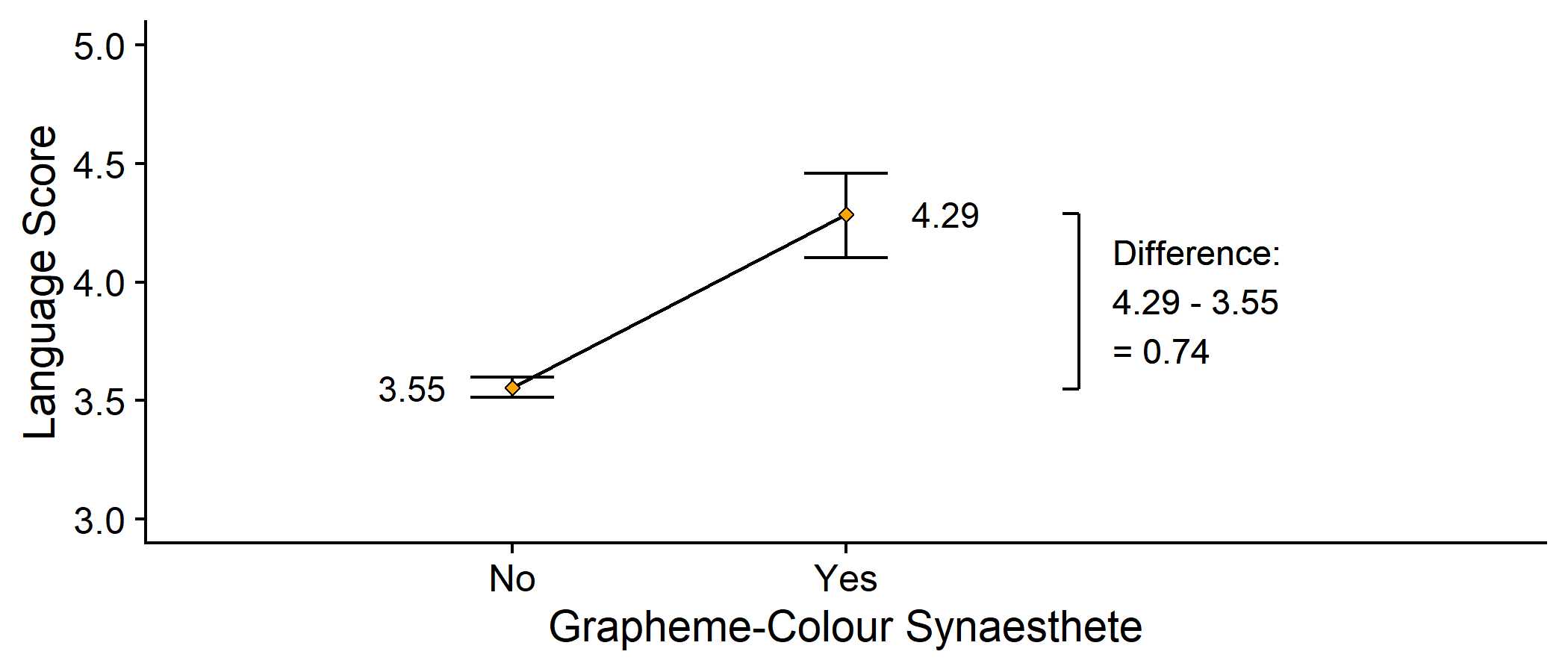
If someone is a synaesthete, predicted Language score = 4.29

bracket <- syn_data %>% group_by(GraphCol) %>% summarise(y = mean(Language)) %>% mutate(x = rep(2.7, 2), y = round(y, 2))syn_data %>% ggplot(aes(x = GraphCol, y = Language)) + #geom_line(stat="summary", fun = mean, aes(group = NA)) + geom_errorbar(stat = "summary", fun.data = mean_cl_boot, width = .25) + geom_point(stat = "summary", fun = mean, shape = 23, fill = "orange") + geom_text(aes(label=round(..y..,2)), stat = "summary", fun = mean, size = 4, nudge_x = c(-.3, .3)) + geom_line(data = bracket, mapping = aes(x, y)) + geom_segment(data = bracket, mapping = aes(x, y, xend = x - .05, yend = y)) + annotate("text", x = bracket$x + .1, y = min(bracket$y) + diff(bracket$y)/2, label = paste0("Difference:\n", bracket$y[2], " - ", bracket$y[1], "\n= ", diff(bracket$y)), hjust=0) + coord_cartesian(xlim = c(0.5, 3.5), ylim = c(3,5)) + scale_y_continuous(name = "Language Score") + labs(x = "Grapheme-Colour Synaesthete") + cowplot::theme_cowplot()Making Predictions
We want our equation to give a different prediction depending on whether someone is a synaesthete or not
Making Predictions
We want our equation to give a different prediction depending on whether someone is a synaesthete or not
Making Predictions
We want our equation to give a different prediction depending on whether someone is a synaesthete or not
When someone is a non-synaestheste (GraphCol = 0)...
Making Predictions
We want our equation to give a different prediction depending on whether someone is a synaesthete or not
When someone is a non-synaestheste (GraphCol = 0)...
When someone is a synaesthete (GraphCol = 1)...
Drawing Lines
- This equation represents a linear model (a line!) between the means
bracket <- syn_data %>% group_by(GraphCol) %>% summarise(y = mean(Language)) %>% mutate(x = rep(2.7, 2), y = round(y, 2))syn_data %>% ggplot(aes(x = GraphCol, y = Language)) + geom_line(stat="summary", fun = mean, aes(group = NA)) + geom_errorbar(stat = "summary", fun.data = mean_cl_boot, width = .25) + geom_point(stat = "summary", fun = mean, shape = 23, fill = "orange") + geom_text(aes(label=round(..y..,2)), stat = "summary", fun = mean, size = 4, nudge_x = c(-.3, .3)) + geom_line(data = bracket, mapping = aes(x, y)) + geom_segment(data = bracket, mapping = aes(x, y, xend = x - .05, yend = y)) + annotate("text", x = bracket$x + .1, y = min(bracket$y) + diff(bracket$y)/2, label = paste0("Difference:\n", bracket$y[2], " - ", bracket$y[1], "\n= ", diff(bracket$y)), hjust=0) + coord_cartesian(xlim = c(0.5, 3.5), ylim = c(3,5)) + scale_y_continuous(name = "Language Score", limits = c(1, 5)) + labs(x = "Grapheme-Colour Synaesthete") + cowplot::theme_cowplot()Drawing Lines
The line starts from the mean of the non-synaesthete group
This is the intercept, which we will call b0
The predicted value of the outcome when the predictor is 0
Drawing Lines
The line starts from the mean of the non-synaesthete group
This is the intercept, which we will call b0
The predicted value of the outcome when the predictor is 0
Changing to the synaesthete group, predicted Language score changes by 0.74
This is the slope of the line, which we will call b1
The change in the outcome for every unit change in the predictor
- This prediction will always have some amount of error, e
Drawing Lines
The line starts from the mean of the non-synaesthete group
This is the intercept, which we will call b0
The predicted value of the outcome when the predictor is 0
Changing to the synaesthete group, predicted Language score changes by 0.74
This is the slope of the line, which we will call b1
The change in the outcome for every unit change in the predictor
This prediction will always have some amount of error, e
In general, then, the linear model has the form:
Drawing Lines
## ## Call:## lm(formula = Language ~ GraphCol, data = syn_data)## ## Coefficients:## (Intercept) GraphColYes ## 3.5549 0.7313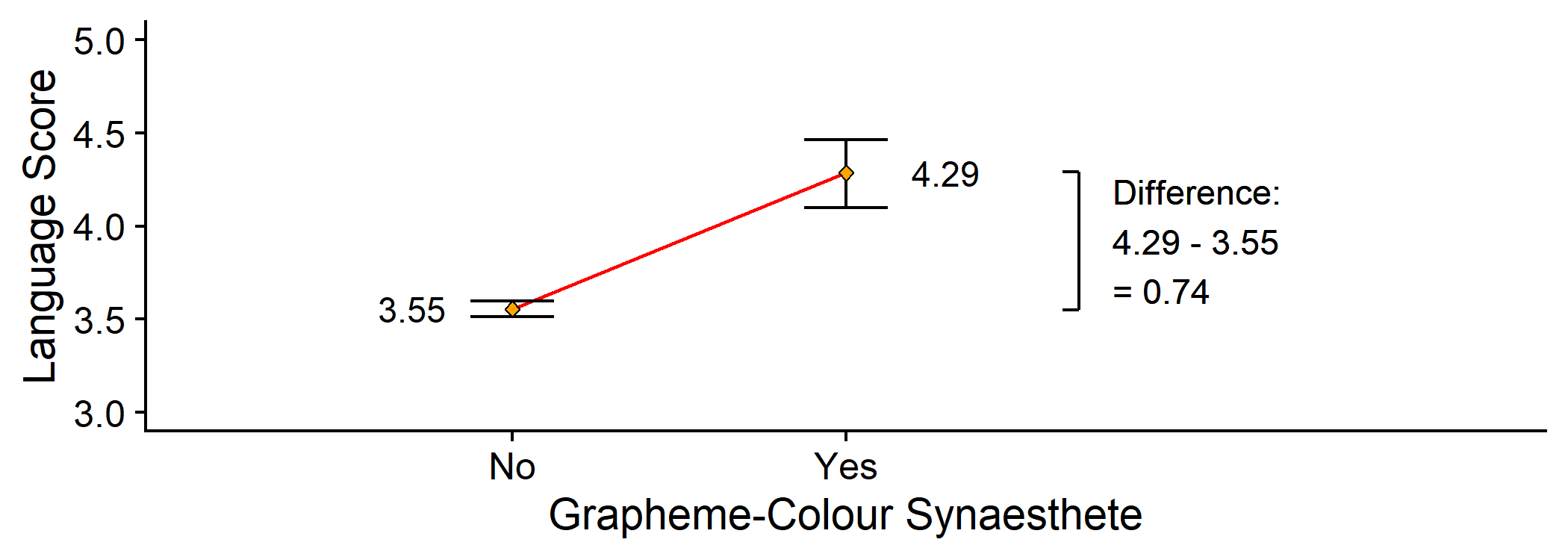
bracket <- syn_data %>% group_by(GraphCol) %>% summarise(y = mean(Language)) %>% mutate(x = rep(2.7, 2), y = round(y, 2))syn_data %>% ggplot(aes(x = GraphCol, y = Language)) + geom_line(stat="summary", fun = mean, aes(group = NA), colour = "red") + geom_errorbar(stat = "summary", fun.data = mean_cl_boot, width = .25) + geom_point(stat = "summary", fun = mean, shape = 23, fill = "orange") + geom_text(aes(label=round(..y..,2)), stat = "summary", fun = mean, size = 4, nudge_x = c(-.3, .3)) + geom_line(data = bracket, mapping = aes(x, y)) + geom_segment(data = bracket, mapping = aes(x, y, xend = x - .05, yend = y)) + annotate("text", x = bracket$x + .1, y = min(bracket$y) + diff(bracket$y)/2, label = paste0("Difference:\n", bracket$y[2], " - ", bracket$y[1], "\n= ", diff(bracket$y)), hjust=0) + coord_cartesian(xlim = c(0.5, 3.5), ylim = c(3,5)) + scale_y_continuous(name = "Language Score", limits = c(1, 5)) + labs(x = "Grapheme-Colour Synaesthete") + cowplot::theme_cowplot()Welcome to lm()!
Today's new function is a very important one
We will use it for the rest of the term and...
It will be very important next year as well!
Creates a linear model ->
lm()- A statistical model that looks like a line
Basic Anatomy of lm()
lm(outcome ~ predictor, data = data)Should look familiar: almost identical to
t.test()!
Basic Anatomy of lm()
lm(outcome ~ predictor, data = data)Should look familiar: almost identical to
t.test()!
t.test
t.test(Language ~ GraphCol, data = syn_data, alternative = "two.sided", var.equal = T)lm
lm(Language ~ GraphCol, data = syn_data)Making Connections
Remember from last week: the "signal" of interest was the difference in means
That same value (0.74) is also the value of b1! (ignoring rounding error...)
The change in Language between synaesthetes and non-synaesthetes
Quantifies the relationship between the predictor and the outcome
This is the key element of the linear model!
Have a Go!
Interim Summary
The linear model predicts the outcome based on a predictor
General form:
b0: the intercept, or value of when is 0
b1: the slope, or change in for every unit change in
The slope b1 represents the relationship between the predictor and the outcome
Up next: continuous predictors
Modelling Gender
Week 4: correlation between femininity and masculinity
- Remember: r expresses degree and direction of the relationship
Today: a linear model using the same variables
- Use this model to make predictions
Visualising the Line
- Ratings of femininity vs masculinity
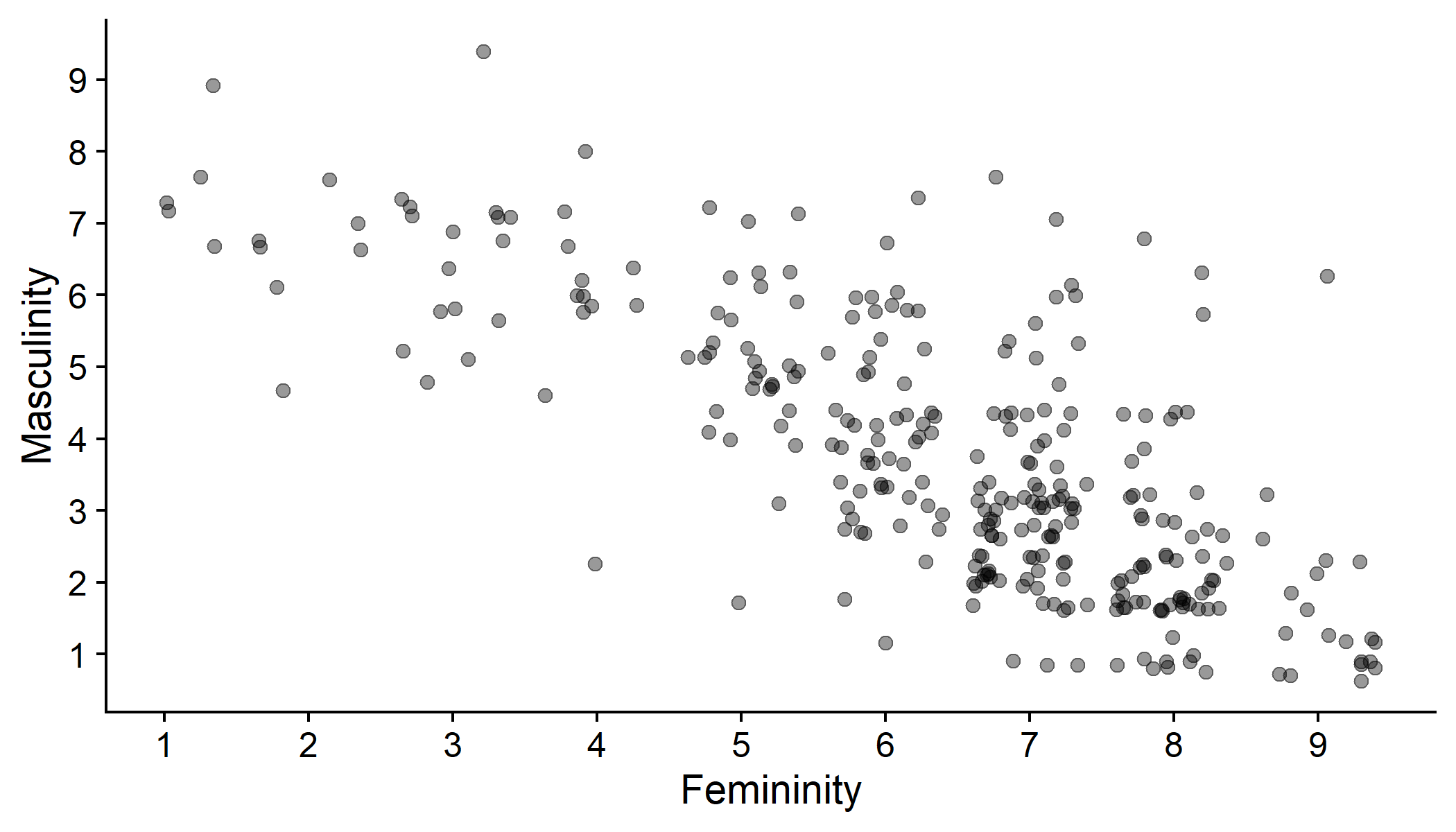
gensex %>% mutate(Gender = fct_explicit_na(Gender)) %>% ggplot(aes(x = Gender_fem_1, y = Gender_masc_1)) + geom_point(position = "jitter", size = 2, alpha = .4) + scale_x_continuous(name = "Femininity", breaks = c(0:9)) + scale_y_continuous(name = "Masculinity", breaks = c(0:9)) + cowplot::theme_cowplot()Visualising the Line
Add a line of best fit for the relationship between femininity and masculinity
- Fits the data with the least squared error (but that's for next year!)
- What do you think the line will look like?
Visualising the Line
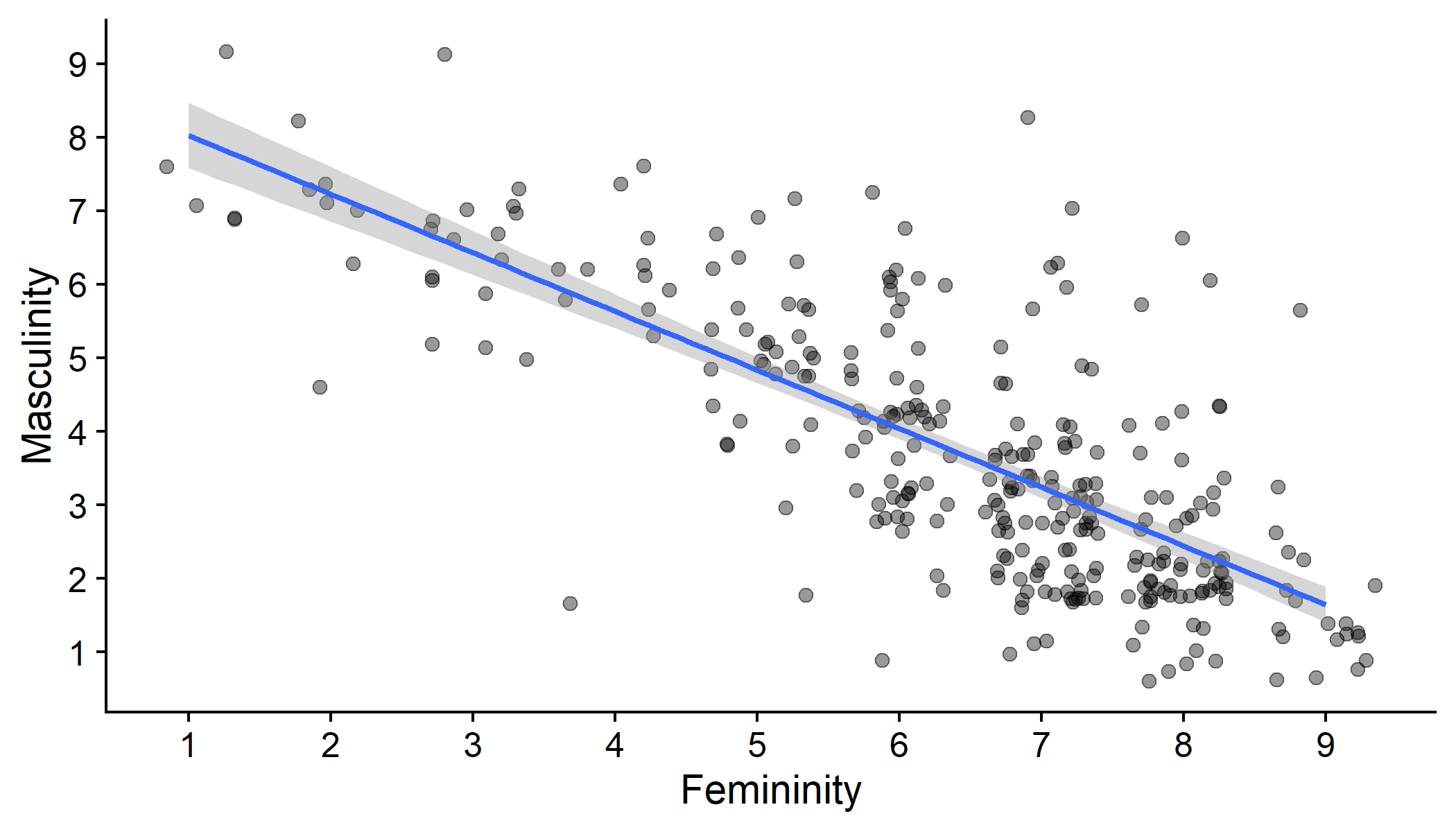
gensex %>% mutate(Gender = fct_explicit_na(Gender)) %>% ggplot(aes(x = Gender_fem_1, y = Gender_masc_1)) + geom_point(position = "jitter", size = 2, alpha = .4) + geom_smooth(method = "lm", formula = y ~ x) + scale_x_continuous(name = "Femininity", breaks = c(0:9)) + scale_y_continuous(name = "Masculinity", breaks = c(0:9)) + cowplot::theme_cowplot()Modelling Gender
Outcome: Masculinity
Predictor: Femininity
b0: value of masculinity when femininity is 0 (the intercept)
b1: change in masculinity associated with a unit change in femininity (the slope)
Modelling Gender
Outcome: Masculinity
Predictor: Femininity
b0: value of masculinity when femininity is 0 (the intercept)
b1: change in masculinity associated with a unit change in femininity (the slope)
Modelling Gender
Modelling Gender
## ## Call:## lm(formula = Gender_masc_1 ~ Gender_fem_1, data = gensex)## ## Coefficients:## (Intercept) Gender_fem_1 ## 8.8246 -0.7976Modelling Gender
## ## Call:## lm(formula = Gender_masc_1 ~ Gender_fem_1, data = gensex)## ## Coefficients:## (Intercept) Gender_fem_1 ## 8.8246 -0.7976
Predicting Gender
We can now use this model to predict someone's rating of masculinity, if we know their rating of femininity
e.g., someone who is not very feminine (rating: 3)
What would the model predict for this person's masculinity rating?
Predicting Gender
So, someone with a femininity of 3 will have a predicted masculinity rating of 6.42
- This is subject to some (unknowable!) degree of error
Comparing to the Model
- Someone with a femininity of 3 will have a predicted masculinity rating of 6.42
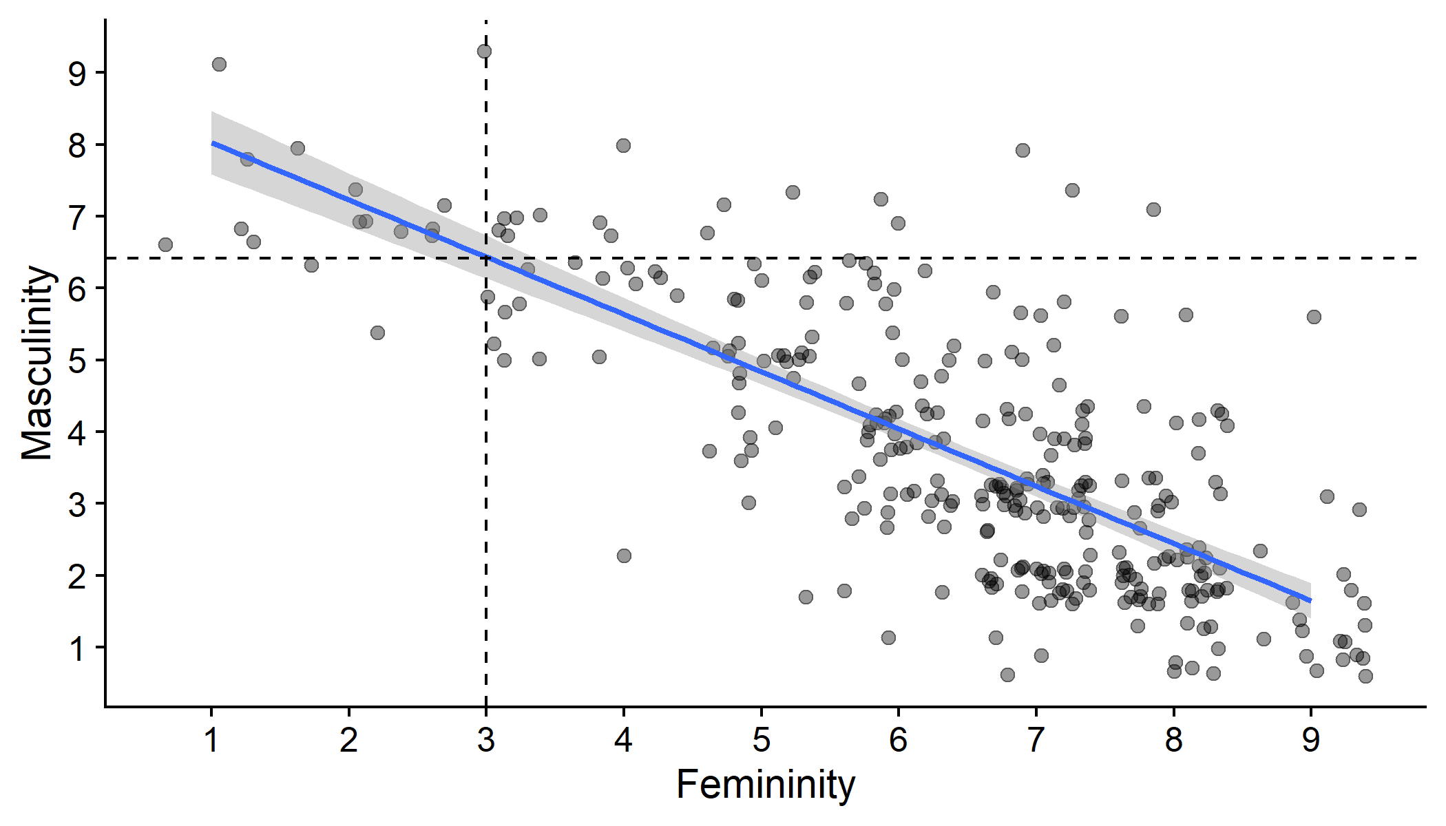
gensex %>% mutate(Gender = fct_explicit_na(Gender)) %>% ggplot(aes(x = Gender_fem_1, y = Gender_masc_1)) + geom_point(position = "jitter", size = 2, alpha = .4) + geom_smooth(method = "lm", formula = y ~ x) + geom_vline(xintercept = 3, linetype = "dashed") + geom_hline(yintercept = 6.42, linetype = "dashed") + scale_x_continuous(name = "Femininity", breaks = c(0:9)) + scale_y_continuous(name = "Masculinity", breaks = c(0:9)) + cowplot::theme_cowplot()Summary
The linear model (LM) expresses the relationship between at least one predictor, , and an outcome,
Linear model equation:
Predictors can be categorical or continuous!
Most important result is the parameter b1, which expresses the change in for each unit change in
Used to predict the outcome for a given value of the predictor
Next week: significance and model fit