Fundamentals of statistical testing
Lecture 1
Dr Milan Valášek
29 January 2021

Overview
Recap on distributions
More about the normal distribution
Sampling
Sampling distribution
Standard error
Central Limit Theorem
Objectives
After this lecture you will understand
that there exist mathematical functions that describe different distributions
what makes the normal distribution normal and what are its properties
how random fluctuations affect sampling and parameter estimates
the function of the sampling distribution and the standard error
the Central Limit Theorem
With this knowledge you'll build a solid foundation for understanding all the statistics we will be learning in this programme!
It's all Greek to me!
is the population mean
is the sample mean
is the estimate of the population mean
Same with SD: , , and
Greek is for populations, Latin is for samples, hat is for population estimates
Recap on distributions
- Numerically speaking, the number of observations per each value of a variable
- Which values occur more often and which less often
- The shape formed by the bars of a bar chart/histogram
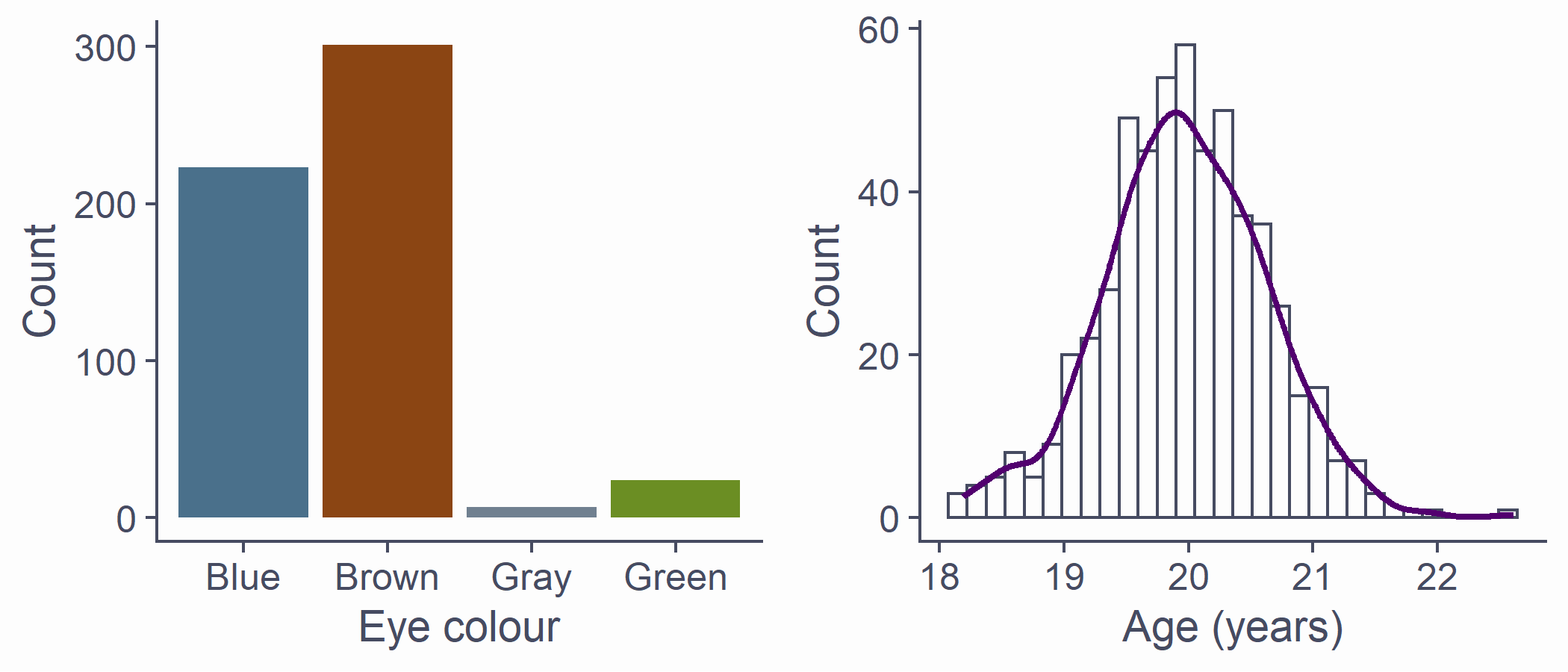
df <- tibble(eye_col = sample(c("Brown", "Blue", "Green", "Gray"), 555, replace = T, prob = c(.55, .39, .04, .02)), age = rnorm(length(eye_col), 20, .65))p1 <- df %>% ggplot(aes(x = eye_col)) + geom_bar(fill = c("skyblue4", "chocolate4", "slategray", "olivedrab"), colour=NA) + labs(x = "Eye colour", y = "Count")p2 <- df %>% ggplot(aes(x = age)) + geom_histogram() + stat_density(aes(y = ..density.. * 80), geom = "line", color = theme_col, lwd = 1) + labs(x = "Age (years)", y = "Count")plot_grid(p1, p2)Known distributions
- Some shapes are "algebraically tractable", e.g., there is a maths formula to draw the line
- We can use them for statistics
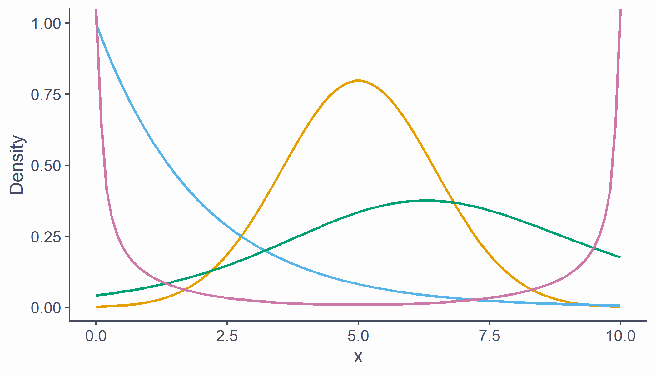
df <- tibble(x = seq(0, 10, length.out = 100), norm = dnorm(scale(x), sd = .5), chi = dchisq(x, df = 2) * 2, t = dt(scale(x), 5, .5), beta = (dbeta(x / 10, .5, .5) / 4) - .15)cols <- c("#E69F00", "#56B4E9", "#009E73", "#CC79A7")df %>% ggplot(aes(x = x)) + geom_line(aes(y = norm), color = cols[1], lwd = 1) + geom_line(aes(y = chi), color = cols[2], lwd = 1) + geom_line(aes(y = t), color = cols[3], lwd = 1) + geom_line(aes(y = beta), color = cols[4], lwd = 1) + labs(x = "x", y = "Density")The normal distribution
AKA Gaussian distribution, The bell curve
The one you need to understand
Symmetrical and bell-shaped
Not every symmetrical bell-shaped distribution is normal!
It's also about the proportions
- The normal distribution has fixed proportions and is a function of two parameters, (mean) and (or SD; standard deviation)
The normal distribution
- Peak/centre of the distribution is its mean (also mode and median)
- Changing mean (centring) shifts the curve left/right
- SD determines steepness of the curve (small = steep curve)
- Changing SD is also known as scaling
Area below the normal curve
- No matter the particular shape of the given normal distribution, the proportions with respect to SD are the same
- ∼68.2% of the area below the curve is within ±1 SD from the mean
- ∼95.4% of the area below the curve is within ±2 SD from the mean
- ∼99.7% of the area below the curve is within ±3 SD from the mean
- We can calculate the proportion of the area with respect to any two points
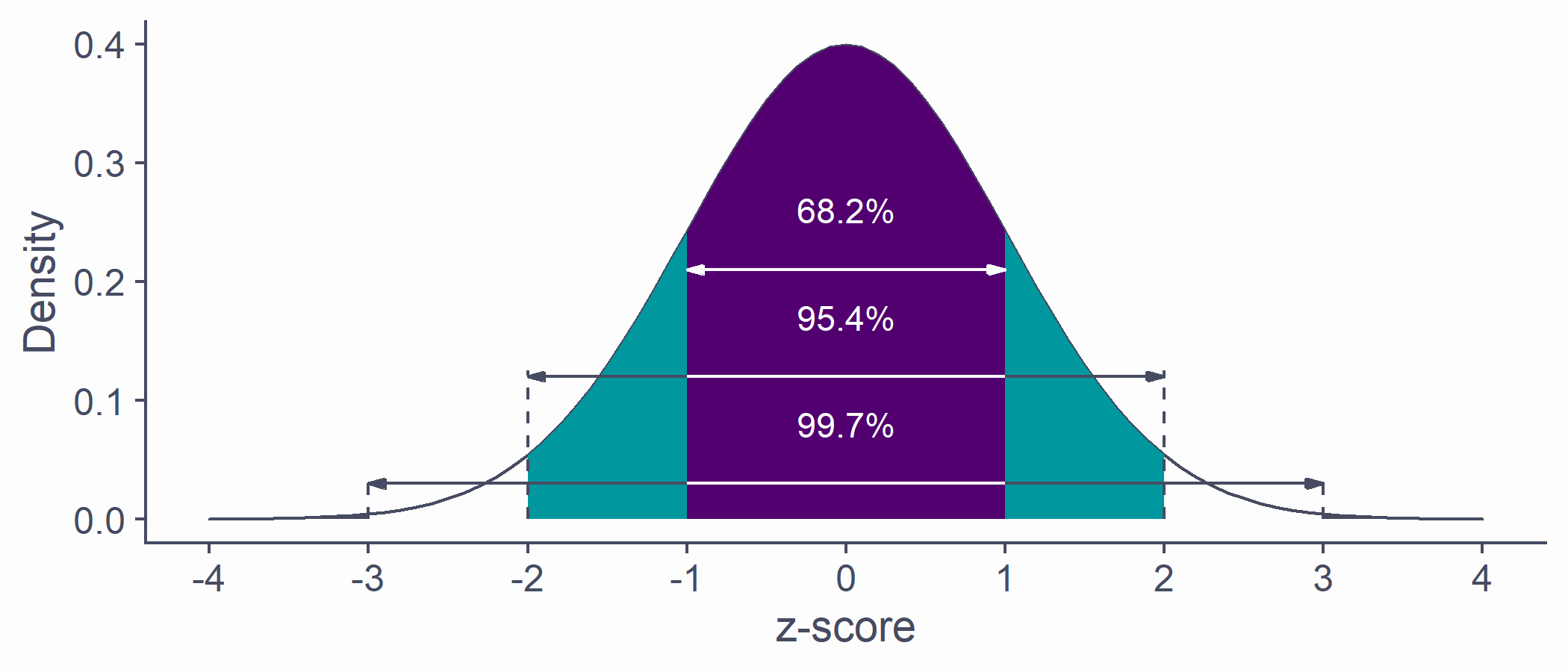
quantiles <- tibble(x1 = -(1:3), x2 = 1:3, y = c(.21, .12, .03))tibble(x = seq(-4, 4, by = .1), y = dnorm(x, 0, 1)) %>% ggplot(aes(x, y)) + geom_density(stat = "identity", color = default_col, fill = default_col) + geom_density(data = ~ subset(.x, x >= quantiles$x1[3] & x <= quantiles$x2[3]), stat = "identity", color = default_col, fill = bg_col) + geom_density(data = ~ subset(.x, x >= quantiles$x1[2] & x <= quantiles$x2[2]), stat = "identity", color = NA, fill = second_col) + geom_density(data = ~ subset(.x, x >= quantiles$x1[1] & x <= quantiles$x2[1]), stat = "identity", color = NA, fill = theme_col) + geom_segment(data = quantiles, aes(x = x1, xend = x2, y = y, yend = y), arrow = arrow(length = unit(0.2, "cm"), angle = 15, type = "closed", ends = "both"), color = c(bg_col, default_col, default_col)) + geom_line(data = tibble(x = rep(c(-1, 1), 2), y = rep(c(.12, .03), each = 2)), aes(x, y, group = y), color = bg_col) + geom_line(data = tibble(x = rep(c(-(2:3), 2:3), each = 2), y = as.vector(rbind(0, rep(quantiles$y[-1] + .005, 2)))), aes(x, y, group = x), lty = 2, color = default_col) + annotate("text", x = rep(0, 3), y = quantiles$y + .05, label = c("68.2%", "95.4%", "99.7%"), color = bg_col) + labs(x = "z-score", y = "Density") + scale_x_continuous(breaks = -4:4)Area below the normal curve
- Say we want to know the number of SDs from the mean beyond which lie the outer 5% of the distribution
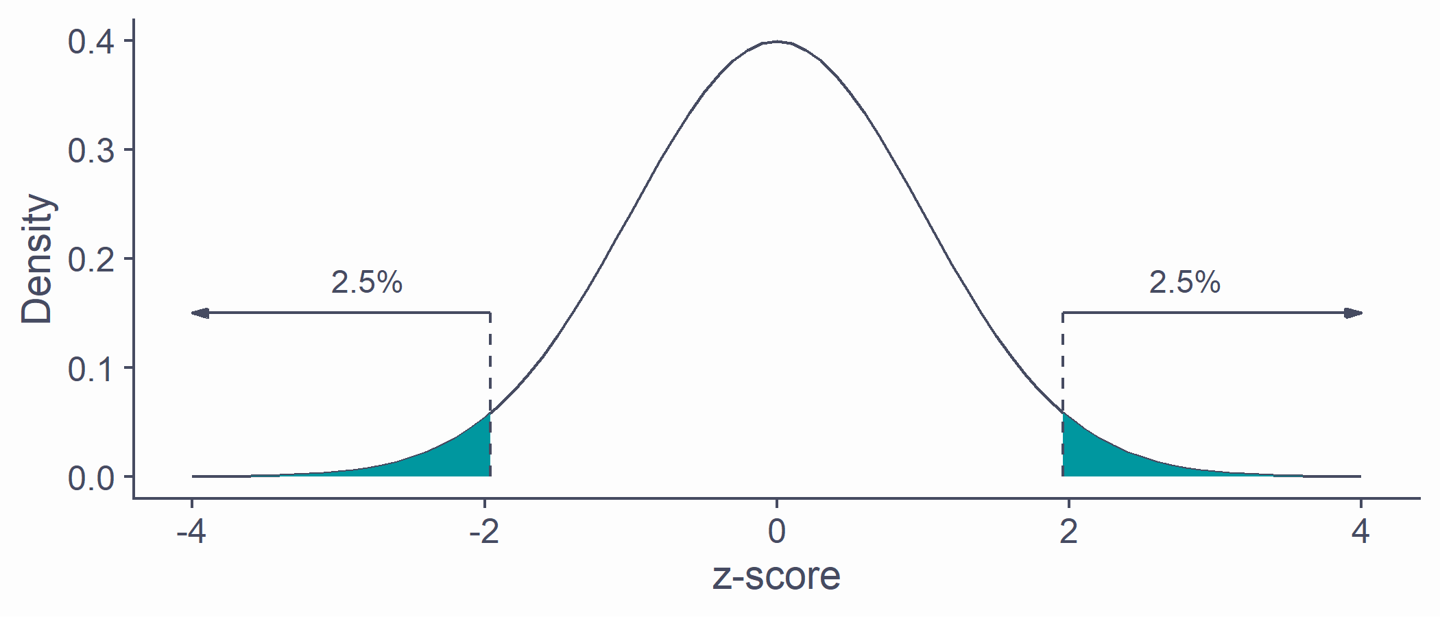
quantiles <- qnorm(.025) * c(-1, 1)tibble(x = sort(c(quantiles, seq(-4, 4, by = .1))), y = dnorm(x, 0, 1)) %>% ggplot(aes(x, y)) + geom_line(color = default_col) + geom_density(data = ~ subset(.x, x >= quantiles[1]), stat = "identity", color = NA, fill = second_col) + geom_density(data = ~ subset(.x, x <= quantiles[2]), stat = "identity", color = NA, fill = second_col) + geom_line(data = tibble(x = rep(quantiles, each = 2), y = c(0, .15, 0, .15)), aes(x, y, group = x), lty = 2, color = default_col) + geom_segment(data = tibble(x = quantiles, xend = c(4, -4), y = c(.15, .15), yend = c(.15, .15)), aes(x = x, xend = xend, y = y, yend = yend), arrow = arrow(length = unit(0.2, "cm"), angle = 15, type = "closed"), color = default_col) + annotate("text", x = c(-2.8, 2.8), y = .18, label = ("2.5%"), color = default_col) + labs(x = "z-score", y = "Density")qnorm(p = .025, mean = 0, sd = 1) # lower cut-off## [1] -1.959964qnorm(p = .975, mean = 0, sd = 1) # upper cut-off## [1] 1.959964Critical values
- If SD is known, we can calculate the cut-off point (critical value) for any proportion of normally distributed data
qnorm(p = .005, mean = 0, sd = 1) # lowest .5%## [1] -2.575829qnorm(p = .995, mean = 0, sd = 1) # highest .5%## [1] 2.575829# most extreme 40% / bulk 60%qnorm(p = .2, mean = 0, sd = 1)## [1] -0.8416212qnorm(p = .8, mean = 0, sd = 1)## [1] 0.8416212- Other known distributions have different cut-offs but the principle is the same
Sampling from distributions
Collecting data on a variable = randomly sampling from distribution
The underlying distribution is often assumed to be normal
Some variables might come from other distributions
Reaction times: log-normal distribution
Number of annual casualties due to horse kicks: Poisson distribution
Passes/fails on an exam: binomial distribution
Sampling from distributions
- Samples from the same population differ from one another
# draw a sample of 10 from a normally distributed# population with mean 100 and sd 15rnorm(n = 6, mean = 100, sd = 15)## [1] 101.61958 80.95560 89.62080 96.04378 106.40106 86.21514# repeatrnorm(6, 100, 15)## [1] 80.31573 107.63193 85.82520 99.95288 93.55956 74.73945Sampling from distributions
- Statistics ( , , etc.) of two samples will be different
- Sample statistic (e.g., ) will likely differ from the population parameter (e.g., )
sample1 <- rnorm(50, 100, 15)sample2 <- rnorm(50, 100, 15)mean(sample1)## [1] 98.56429mean(sample2)## [1] 105.4175Sampling from distributions
Statistics ( , , etc.) of two samples will be different
Sample statistic (e.g., ) will likely differ from the population parameter (e.g., )
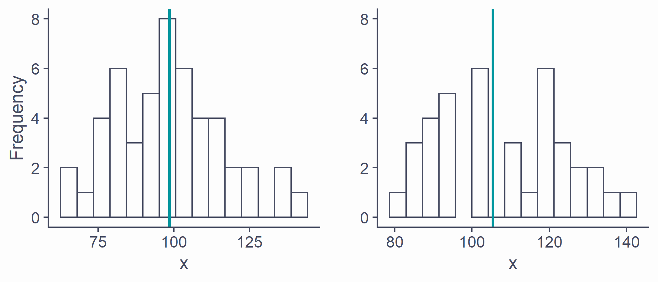
p1 <- ggplot(NULL, aes(x = sample1)) + geom_histogram(bins = 15) + geom_vline(xintercept = mean(sample1), color = second_col, lwd = 1) + labs(x = "x", y = "Frequency") + ylim(0, 8)p2 <- ggplot(NULL, aes(x = sample2)) + geom_histogram(bins = 15) + geom_vline(xintercept = mean(sample2), color = second_col, lwd = 1) + labs(x = "x", y = "") + ylim(0, 8)plot_grid(p1, p2)Sampling distribution
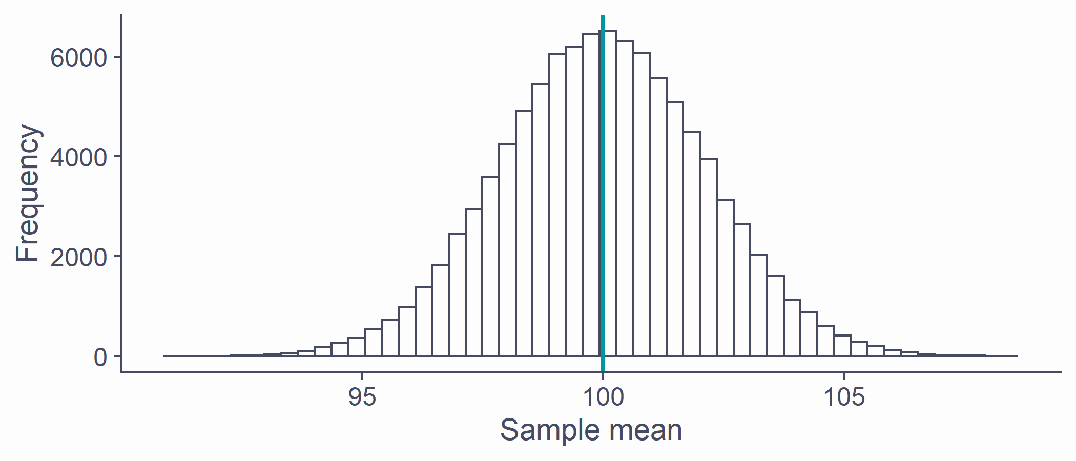
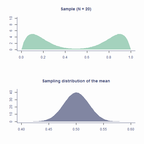
If we took all possible samples of a given size (say N = 50) from the population and each time calculated , the means would have their own distribution
This is the sampling distribution of the mean
Approximately normal
Centred around the true population mean,
Every statistic has its own sampling distribution (not all normal though!)
Standard error
- Standard deviation of the sampling distribution is the standard error
sd(x_bar)## [1] 2.122072- Sampling distribution of the mean is approximately normal: ~68.2% of means of samples of size 50 from this population will be within ±2.12 of the true mean
Standard error
- Standard error can be estimated from any of the samples
samp <- rnorm(50, 100, 15)sd(samp)/sqrt(length(samp))## [1] 1.872102# underestimate compared to actual SEsd(x_bar)## [1] 2.122072- If ~68.2% of sample means lie within ±1.87, then there's a ~68.2% probability that will be within ±1.87 of
mean(samp)## [1] 98.22903Standard error
- SE is calculated using N: there's a relationship between the two
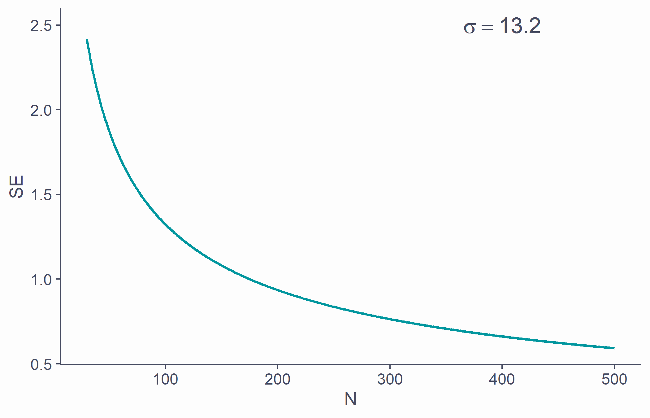
tibble(x = 30:500, y = sd(samp)/sqrt(30:500)) %>% ggplot(aes(x, y)) + geom_line(lwd=1, color = second_col) + labs(x = "N", y = "SE") + annotate("text", x = 400, y = 2.5, label = bquote(sigma==.(round(sd(samp), 1))), color = default_col, size = 6)Standard error
- That is why larger samples are more reliable!
Standard error
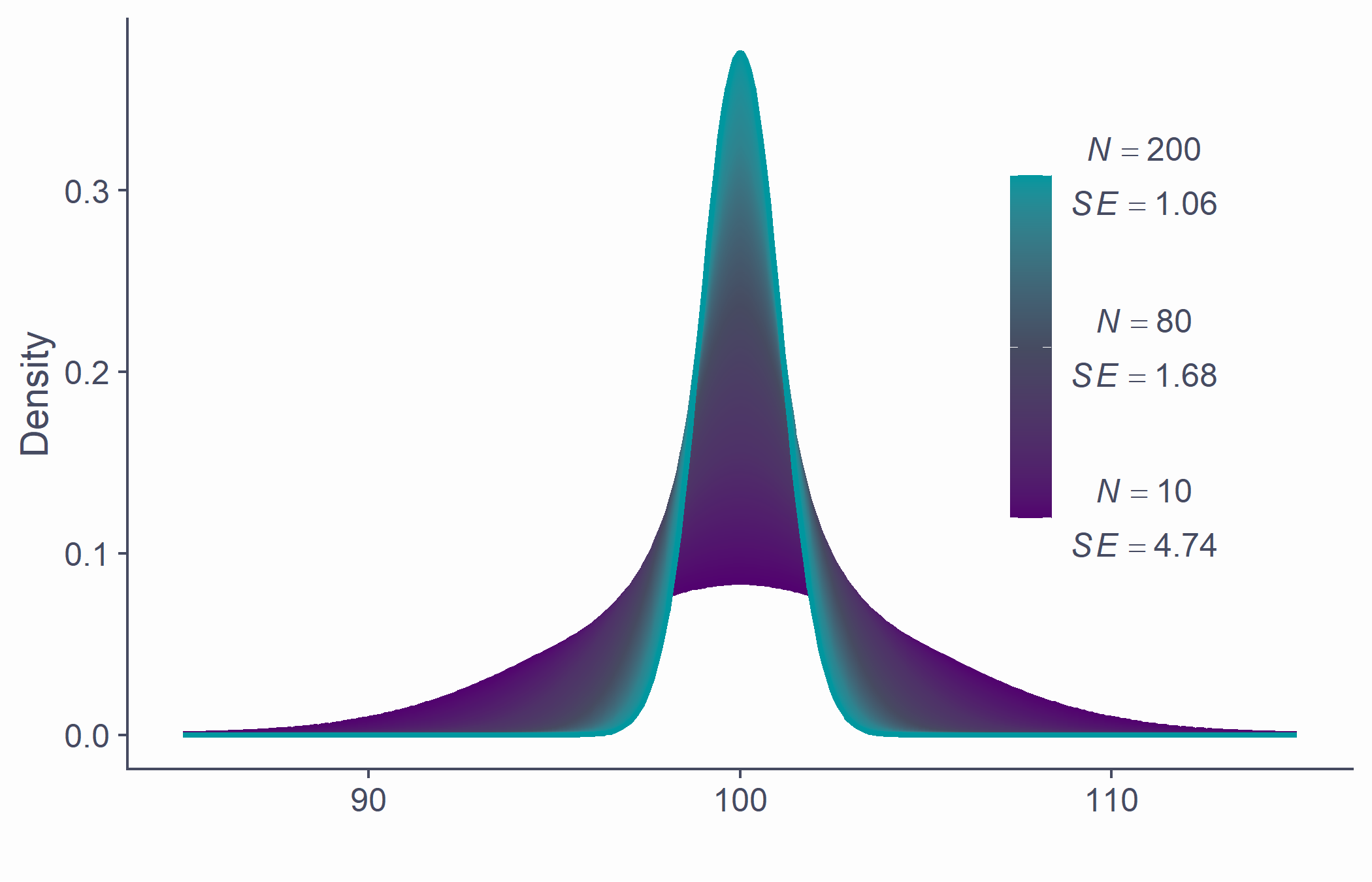
Allows us to gauge the resampling accuracy of parameter estimate (e.g., ) in sample
The smaller the SE, the more confident we can be that the parameter estimate ( ) in our sample is close to those in other samples of the same size
We don't particularly care about our specific sample: we care about the population!
The Central Limit Theorem
Sampling distribution of the mean is approximately normal
True no matter the shape of the population distribution!
This is the Central Limit Theorem
- "Central" as in "really important" because, well, it is!
CLT in action
CLT in action

Approximately normal
- As N gets larger, the sampling distribution of tends towards a normal distribution with mean = and
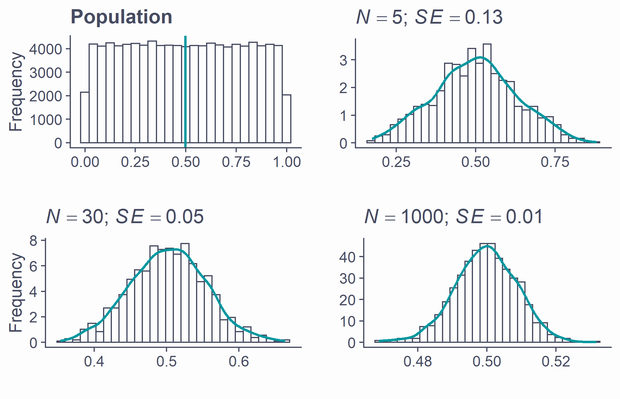
par(mfrow=c(2, 2), mar = c(3.1, 4.1, 3.1, 2.1), cex.main = 2)pop <- tibble(x = runif(100000, 0, 1)) %>% ggplot(aes(x)) + geom_histogram(bins = 25) + geom_vline(aes(xintercept = mean(x)), lwd = 1, color = second_col) + labs(title = "Population", x = "", y = "Frequency")plots <- list()n <- c(5, 30, 1000)ylab <- c("", "Frequency", "")for (i in 1:3) {plot_tib <- tibble(x = replicate(1000, mean(runif(n[i], 0, 1))))plots[[i]] <- ggplot(plot_tib, aes(x)) + geom_histogram(aes(y = ..density..), bins = 30) + labs(title = bquote(paste( italic(N)==.(n[i]), "; ", italic(SE)==.(round(sd(plot_tib$x), 2)))), x = "", y = ylab[i]) + # xlim(0:1) + stat_density(geom = "line", color = second_col, lwd = 1)}plot_grid(pop, plots[[1]], plots[[2]], plots[[3]])Take-home message
Distribution is the number of observations per each value of a variable
There are many mathematically well-described distributions
- Normal (Gaussian) distribution is one of them
Each has a formula allowing the calculation of the probability of drawing an arbitrary range of values
Take-home message
Normal distribution is
- continuous
- unimodal
- symmetrical
- bell-shaped
- it's the right proportions that make a distribution normal!
In a normal distribution it is true that
- ∼68.2% of the data is within ±1 SD from the mean
- ∼95.4% of the data is within ±2 SD from the mean
- ∼99.7% of the data is within ±3 SD from the mean
Every known distribution has its own critical values
Take-home message
Statistics of random samples differ from parameters of a population
As N gets bigger, sample statistics approaches population parameters
Distribution of sample parameters is the sampling distribution
Standard error of a parameter estimate is the SD of its sampling distribution
Provides margin of error for estimated parameter
The larger the sample, the less the estimate varies from sample to sample
Take-home message
Central Limit Theorem
Really important!
Sampling distribution of the mean tends to normal even if population distribution is not normal
Understanding distributions, sampling distributions, standard errors, and CLT it most of what you need to understand all the stats techniques we will cover